KUZEN DESIGN SYSTEM
Building a design system for chatbot maker platform
Design System, Creative Direction
Overview
KUZEN is a B2B web app that helps users build chatbots unique to their business needs, whether it's for lead generation, process automation, or customer service. I was in charge of restructuring its design system as the main UX/UI designer and product owner.
My Role/s
- UX/UI Designer
- Product Owner
Services/Methods
- User research
- Wireframing
- User interface design
- Visual design
- Project Management
Deliverables
- Component Library
- Module and Page Templates
- Style Guide
- Team training
20
TEMPLATES
50+
COMPONENTS
25+
STYLE GUIDE PAGES
Challenge
Overhauling an outdated design system
With the clientele expanding and a demand for more features to be added, so is the need to ensure a consistent and seamless user experience across the app. This is obviously easier said than done, especially when the app’s design system has been poorly maintained and has become almost unusable.
I undertook the task of overhauling our existing design system to help us build on-brand, consistent interfaces quicker and more effectively.
Outcome
An updated, more organized design system
A newly revamped component library, coupled with a style guide for developers and designers.
Project Context
Over the course of this project, I worked closely with the development team as I was building the design system and managed the timings, as well as prioritization on rolling them out. I took on this endeavor concurrently with product optimization tasks, thus in order to minimize the workload, the new specifications were handed over on a weekly basis (with release timings kept flexible).
This way, we can ensure that once we implement it on the product, the components are all ready in the development team's side.
Approach
Taking stock of what we currently have and build upon it
Conducting a design system audit
Inspecting the current system. We looked at what we already had and assessed if we need to delete or revise existing components. For instance, one critical issue found was the presence of duplicated components applied to a handful of UI screens, making implementing global UI changes impossible. Mockups were also inspected to see if there were overlooked elements that should be included in the design system going forward.

Symbols like "base" indicated above has been replicated multiple times.
Looking into how teams collaborate. Simply creating pixel-perfect components isn't enough. Insights on how the design team works with the development team were gathered. As it turns out, though developers have specifications on file, they rarely follow them because they're outdated and therefore rely on inspecting mockups handed over by designers. This resulted in inconsistencies in the app's UI.
Taking inspiration from established design systems. We explored well-known design systems like IBM's Carbon System, Atlassian Design System, and Google's Material Design to see how theirs were constructed and which we can adapt to our own.
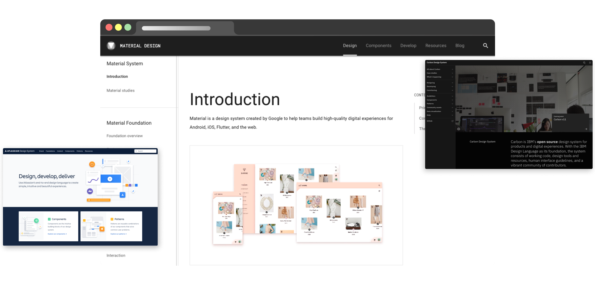
Inspected known established design systems to see what we can emulate for our own product.
Consolidation
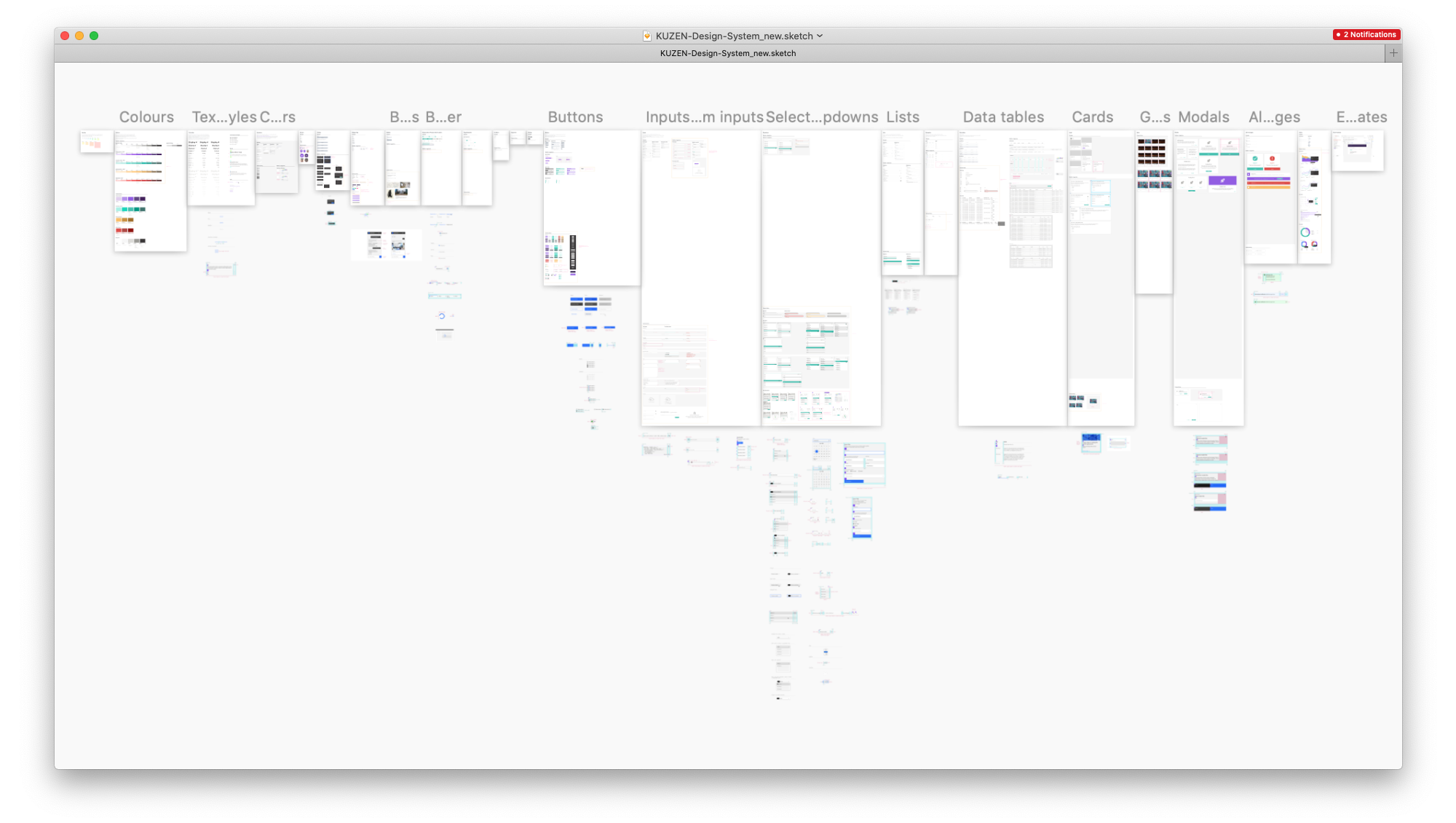
After examining every mockup on file and components already registered in the system, I went ahead and grouped similar components together, laid them out in their own artboards, including snippets of reference components (from the other design systems we looked at) which we deemed necessary to make as shown in image above.
Solution
Revamping the design system
Once we took stock of the work ahead, I began restructuring our design system, inspired by the alternate way of organizing components proposed by Dennis Reimann's article, "Atomic Design is messy, here's what I prefer". It presents a new format of classifying components that isn't too restricting, given that Atomic Design had HTML elements in mind when it was formulated.
Foundations. Consists of basic building blocks such as color, typography, and iconography. New color hues were added as well as text styles. Shadow specifications were finally defined and renamed icons symbols for easier access as well as enabled adding placeholder for different sizes, so the design team can simply override the symbols without manually changing each instance.
Components (also called "Elements"). In Dennis Reimann's article, it's called Elements, but I chose to stick with "components" for familiarity's sake. Taking what has been established in the Foundations, I proceeded to create the basic UI elements like buttons, input, dropdown menu, list, etc.


Modules. Taking things a step further, using the newly-made components, they're combined into cohesive units called Modules. These would be the navigation sidebars, modal windows, data tables, card elements, and analytics charts.


Templates. Lastly, I made the page templates combining the modules and components, based on layout patterns seen across the app.
Creating a guide and team onboarding
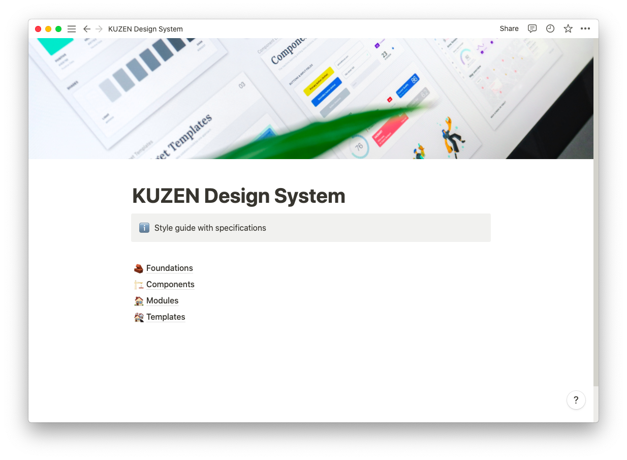
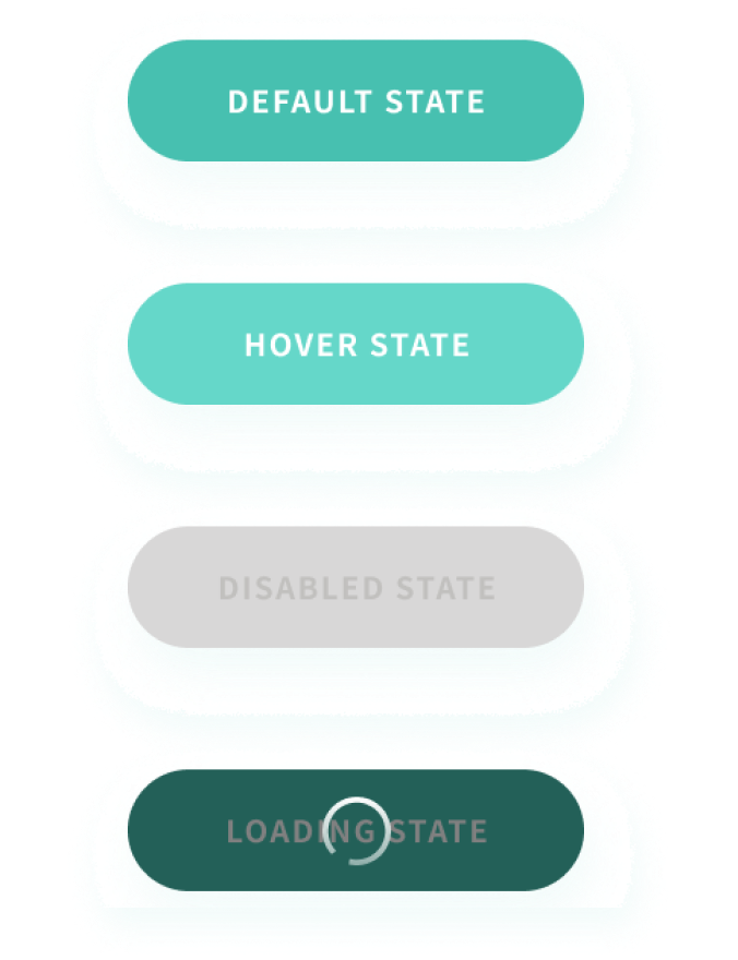
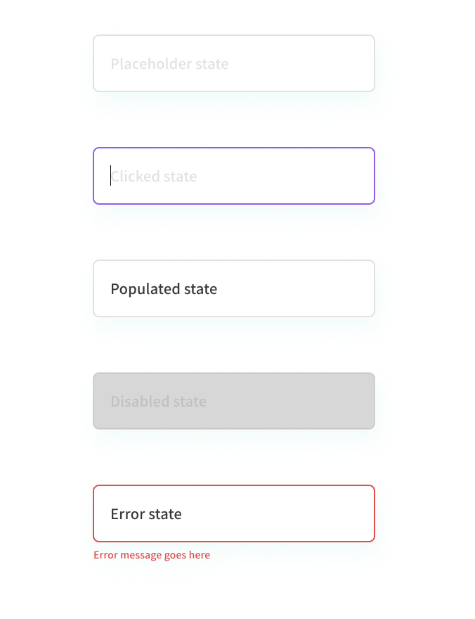
Establishing a common knowledge base. Although we now have a revamped component library, there was still a struggle in establishing a common understanding of how we're supposed to use incorporate the new design system in our deliverables. I then created a style guide explaining the do's and don'ts, as well as detailed specifications for developers.
Validation
Improving the team's overall productivity and workflow
With the design system now fully made over, our designers can finally incorporate it in their workflow and deliver more consistent designs, which in turn quickened the developers' pace of implementing them.
What's next
Just like any digital product, a design system needs regular maintenance and inspection to keep it up-to-date. Going forward, I wish to further enhance it by:
- Building upon the established style guide;
- Creating a pattern library, a collection of combined reusable components addressing common user actions;
- Crafting custom-made resources (such as icons and illustrations) that our designers can utilize.
Takeaways
Gaining better insight into how collaboration happens between developer and design teams
Working on this endeavor helped me understand more about our product and how our teams collaborate, as well as honed my technical knowledge in visual design. I'm also thankful for the opportunity of being the product owner. It taught me how to manage tasks, manpower, set priorities, and make decisions necessary to move the project in the right direction.
It was a lot of upfront hard work but the payoff has been all worth it. Developers now have a unified source of specifications without having to look at every component in our prototypes or mockups. It made working with other teams more seamless at the same time enabling us to create a more cohesive user experience at a faster pace, which is beneficial both for us and our customers.
